Draw and visualize AWS diagram
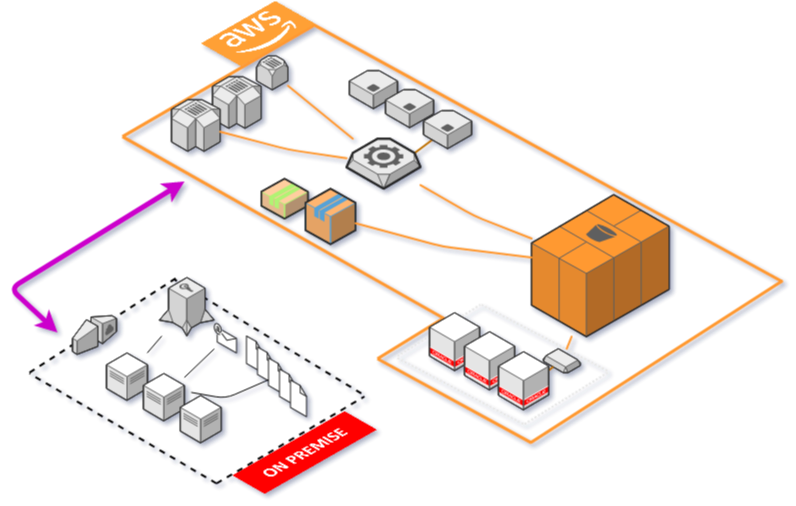
Import your existing infrastructure and turn it into an interactive AWS Diagram.
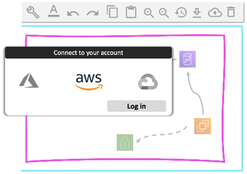
Connect to your AWS account and import your infra
Holori imports your existing AWS infrastructure and turns it into a live AWS diagram that is synchronize daily. Discover all your AWS assets and their configurations. No need to spend days mapping something that already exist manually. Holori fetch your AWS data with Read Only Access.
Visualize how your AWS infra evolves
With Holori daily Sync, your AWS diagram gets updated automatically. Utilizing a straightforward color code, you can easily distinguish additions, deletions, and modifications in your AWS account since the last synchronization. Effortlessly navigate through historical data to uncover changes and events over time!
Tailor your AWS diagram views
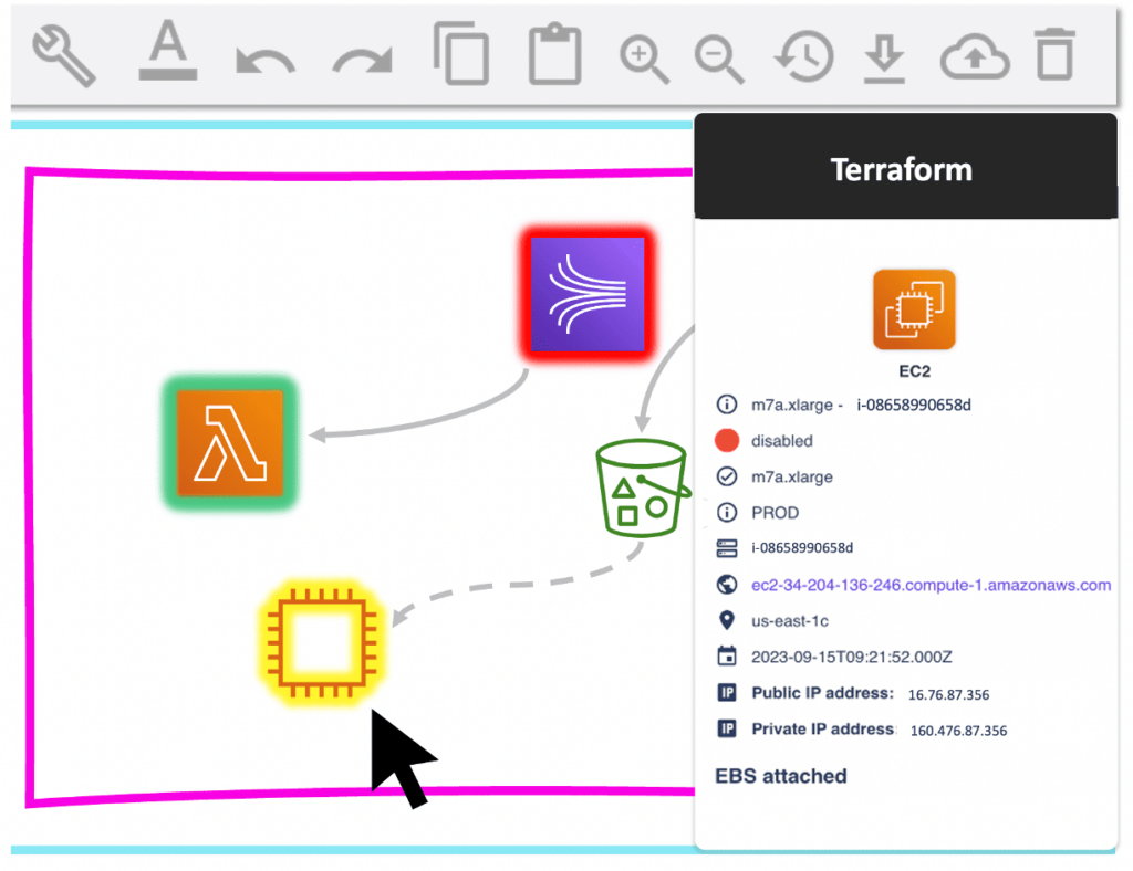
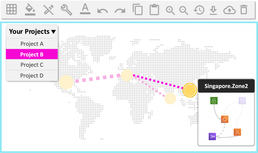
Filter and switch your view for various use cases and stakeholders (dev, devops, IT, project manager). Zoom out on the interactive map to see your company’s infrastructure worldwide and how it is shared across projects. Zoom in to see the architecture for one project or by AWS VPC and dive even deeper to view the tags and metadata of each AWS instance or service.
Put your AWS documentation on Autopilot
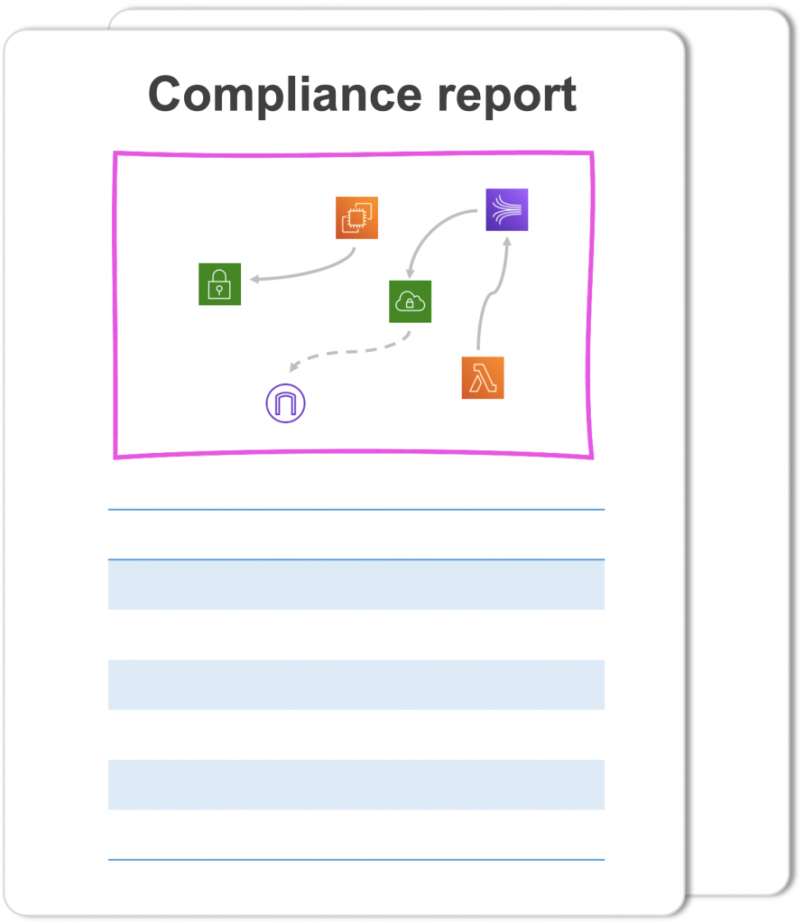
You hate spending days doing manual documentation? That’s why Holori does it automatically for you. This documentation encompasses your AWS diagram, along with a comprehensive list of resources and their configurations. Make sure your infrastructure is compliant with GDPR, SOC 2, PCI…
You don't need to choose anymore between having poor documentation
or wasting worthy DevOps time
Made for your AWS architecture needs
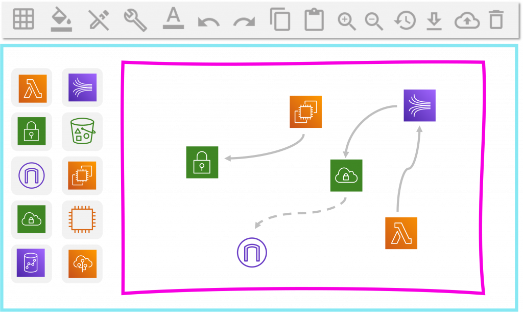
Holori uses the official and latest AWS architecture icons. Each icon feature a real AWS service: AWS Lambda, AWS EC2, AWS EBS, AWS kinesis…All services are ranked by categories on the left panel making it easy to search within the 200 AWS products. Holori diagramming software also provide architecture template that you can use for free.
Estimate price for each AWS service
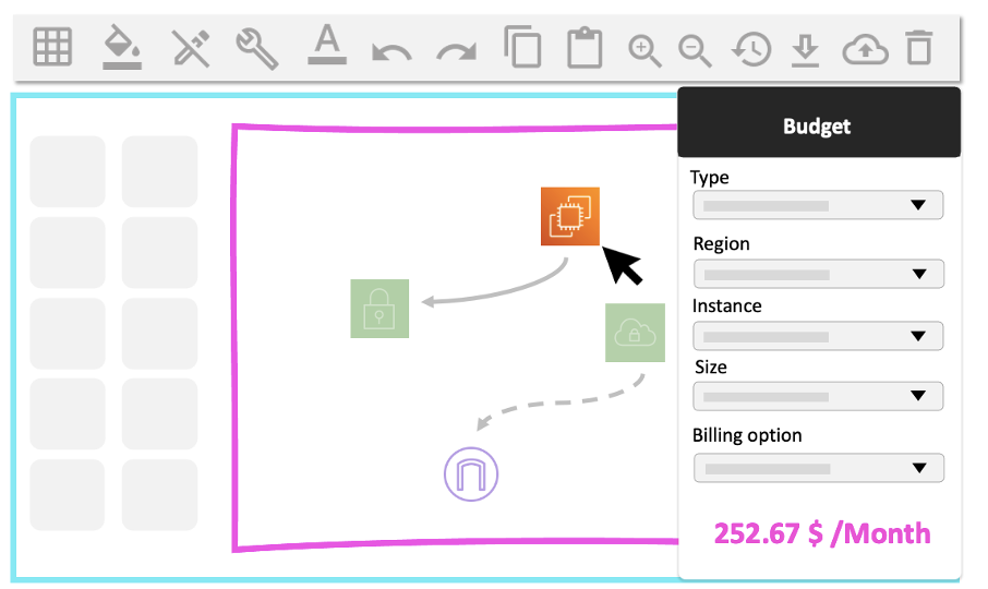
AWS catalog is very complex with different pricing by Availability Zone making endless possible configurations. For each AWS component in the cloud diagram, Holori recommends the right mix between price and performance for each service. Users can change the AWS service and try different alternatives such as comparing the price between AWS and Azure/GCP for each service. Holori cloud diagram is powered by our cloud calculator that is benchmarking more than 50 000 cloud providers’ services. Thus, Holori simulate thousands of scenarios to identify the best infrastructure saving our customers more than 70% in cloud costs.
AWS diagrams for enhanced collaboration
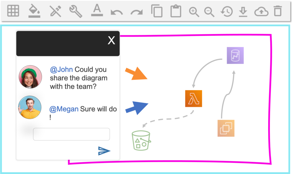
IT and DevOps teams are more and more split across multiple locations. Remote work has accelerated this trend and teams need new tools to collaborate on their AWS infrastructure. Especially that their infrastructure is often shared across several projects, stakeholder and departments. Using Holori AWS diagram tool, you can bring transparency across your entire organization and this is also true for your finance department that needs cost visibility!
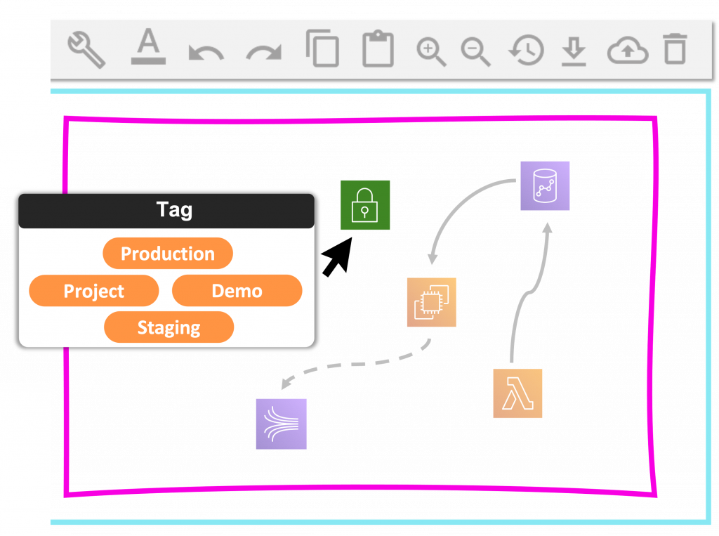
Tag your AWS diagrams ' components
Learning terraform through diagramming
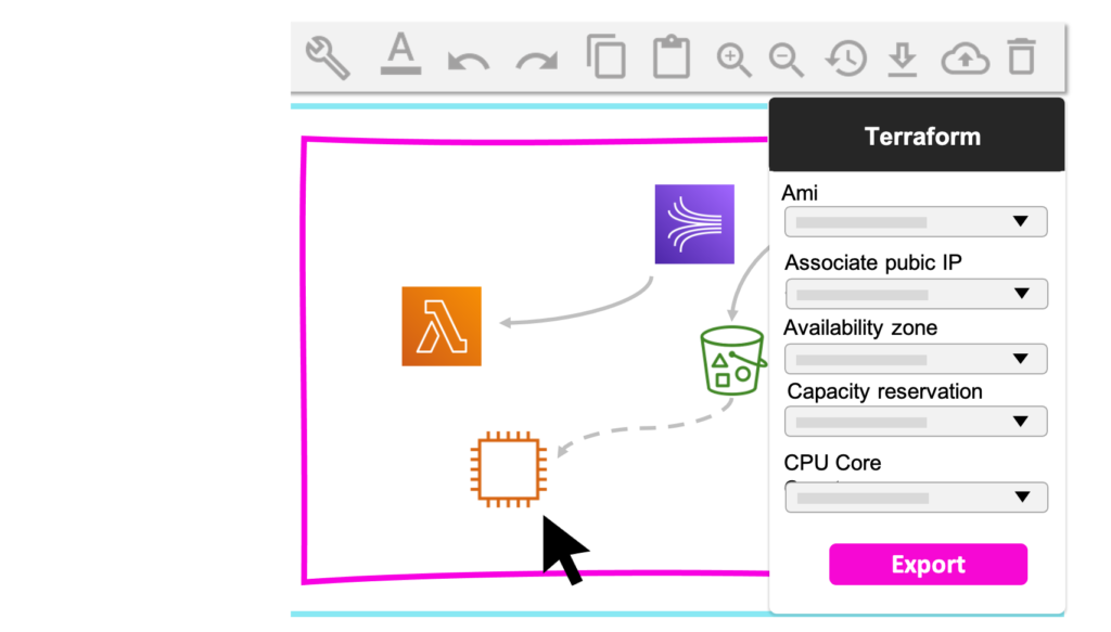
Wether you are familiar with IaC / Terraform or not, Holori AWS diagramming software will help you deploy your infrastructure faster. For each AWS product icon you drop in the diagram, Holori gives you the full list of attributes you need to fill to make your terraform file ready for deployment. Rather than spending countless hours in the Terraform documentation, to find the variables for each AWS product, Holori has already prepared the field and acts as your terraform assistant ! Bringing a visualisation tool on top of Terraform code will help you to detect errors and control your IaC script.
