Build awesome multi cloud diagrams
Design your cloud diagram or automatically generate AWS, AZURE & GCP diagrams from your existing infrastructure!
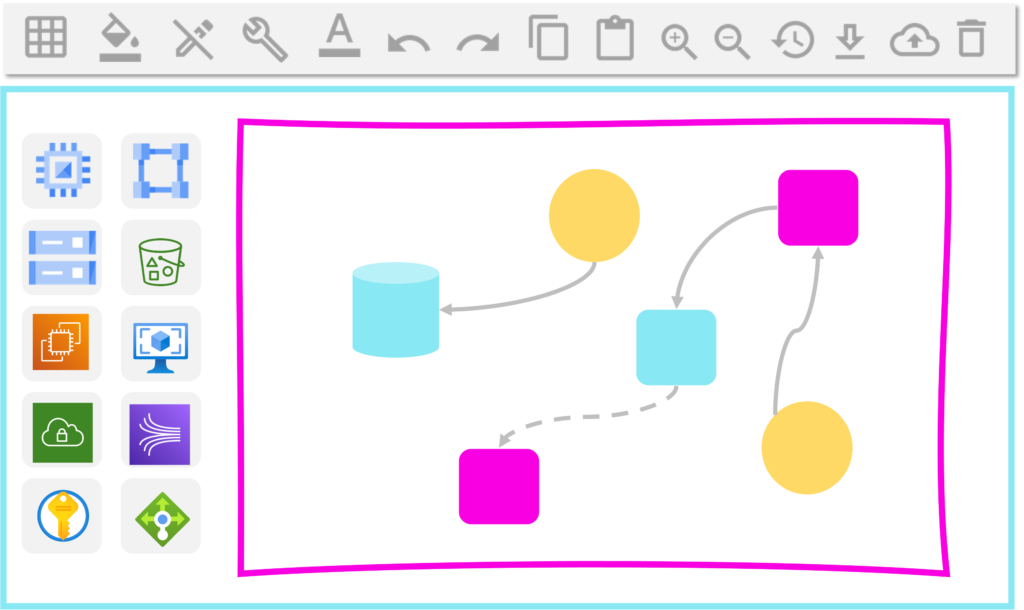
Automatically generate cloud diagrams or design them from scratch
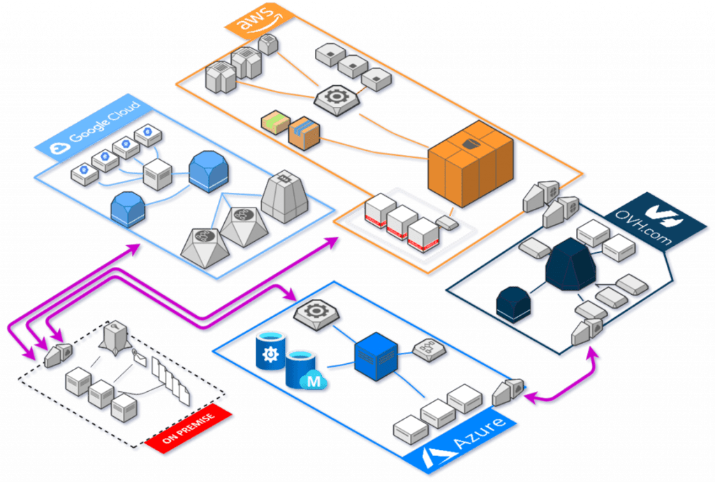
Holori seamlessly syncs with your cloud accounts (read-only) to automatically generate a detailed cloud diagram of your AWS, Azure, or GCP environment. This interactive diagram updates regularly, allowing you to visualize your infrastructure, track changes over time, and ensure optimal configuration. You can modify the diagram directly in Holori or design one from scratch to plan and optimize your architecture.
The only Cloud Diagram tool supporting all cloud providers
From large Hyperscalers to more local cloud providers, we got your back. Holori gather all the cloud providers’ library icons. You can use Holori cloud diagramming tool for AWS, Azure, GCP, OCI, DigitalOcean, Hetzner, Cisco, Scaleway, K8S, tencent and more…
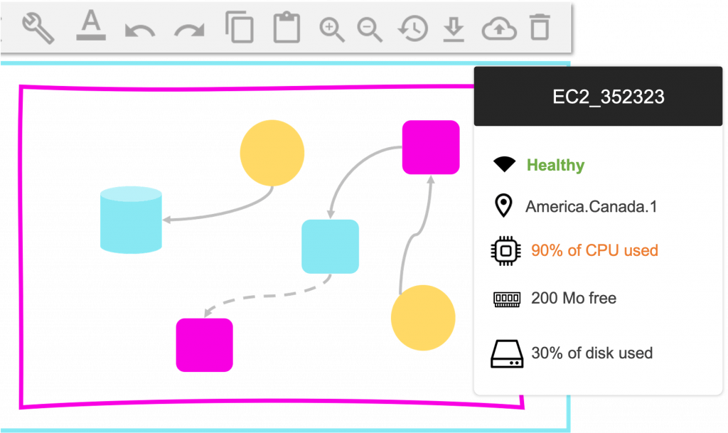
See how your cloud infrastructure is configured
By connecting to your cloud providers’ accounts, Holori displays the configuration of each resource and give you an overview of your global infrastructure in a glimpse. Holori provides a detailed inventory of all your resource configuration and you can export it.
Holori combines cloud diagrams and cost dashboards into a single interface, giving you complete clarity over your cloud infrastructure!

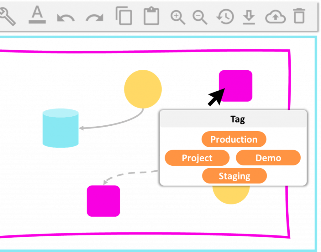
Use Filters to tailor cloud diagrams to your needs
Use filters to navigate through your complex cloud setup. WIth Holori cloud diagramming tool, you can filter by resource, regions or tags to only see what matters.
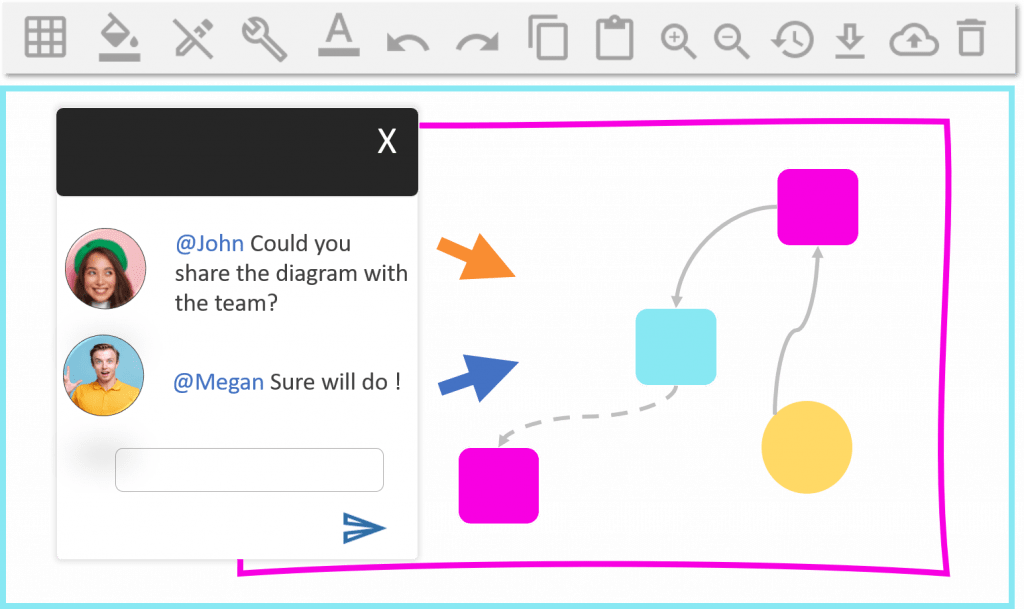
Better teamworks with cloud diagrams
Cloud diagram is a complicated and tricky topic. Having a visual support will help your teams to work more smoothly, reduce errors and align their thoughts.
With Holori cloud diagram software, teams are able to work together, faster and better. Onboarding of new team members is also facilitated.
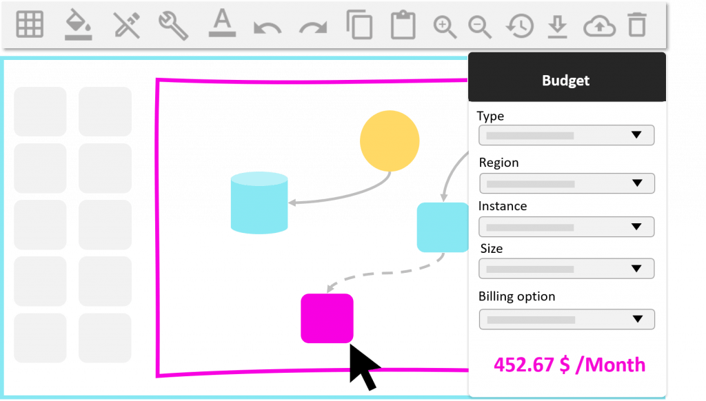
Estimate the cost of your future infrastructure
Save up to 50 % on cloud bills
10X time faster from design to deployment
100% visibility on cloud resources and their costs
Automate your cloud documentation
No a single cloud engineer likes to do documentation. But with Holori cloud diagram tool your documentation is entirely automated. At every synchronization, a new PDF containing a diagram view of your infra, the list of all your assets and their configuration is automatically generated.

Speed up Terraform learning curve
Terraform and more generally Infrastructure as Code emerged as a market practice because it automates the provisioning of infrastructure . Unfortunately, it’s not standardized between cloud providers and you need to go to the Terraform documentation to find the right attributes.
Holori makes it easier as we have already listed all the attributes for each resource type and for every cloud provider. You just need to fill them up and export your Terraform. Having a visual support on top of your terraform script will help reduce errors!