What is an architecture diagram?
Have you ever tried to explain something complicated to someone and it doesn’t seem to be working despite your best efforts? You’re out of words to rephrase your explanation.

If you’ve ever been in a situation like this, you’ve undoubtedly observed that getting a piece of paper and a pen and rapidly drawing a graph/map/diagram was the greatest method to assist the other person and help him imagine what you were thinking. This is the key to assisting individuals in comprehending complex circumstances, assisting them in visualizing the different aspects involved, their interactions, the surroundings, and so on. A picture is worth a thousand words, because it can explain any notion faster and more effectively than any other kind of documentation or coding.
The same rules are applicable in the IT industry. Any experienced developer or architect will tell you that an architecture diagram is essential for planning any new project or mapping your existing infrastructure. It simplifies the task of enterprises recognizing the cloud environment.
An architecture diagram is an illustration that depicts the physical implementation of software system components. It depicts the overall structure of the software system as well as the relationships, constraints, and boundaries between each piece. Moreover, it shows the entire system and all of its components.
There are multiple benefits of using architecture diagrams, they can be updated continuously and infinite times in order to accommodate new services or remove pesky bugs. The technical team working on it can understand the architecture diagram easily. But for non-tech team members, it would be difficult. So in order to maximize the output and include non-tech team members, architecture diagrams are used. These diagrams are so effective and easy to comprehend that even a young kid can understand the infrastructure. Hence, it enhances visibility, collaboration and understanding.
What is a cloud architecture diagram?
According to the Cambridge Dictionary, a diagram is “a drawing that explains how a system, machine, process, plan, etc., operates or is arranged.”
When it comes to IT infrastructure, everything is physically located on your premises and each piece of hardware can be identified. Everything is physical, including hard drives, CPUs, and wires. In a hybrid or entirely cloud-based solution, you do not have physical access to the cloud components.
All the components of your infrastructure such as storage, memory, network, and other miscellaneous resources are virtual. So it is crucial to properly map and understand them properly to maximize the output.
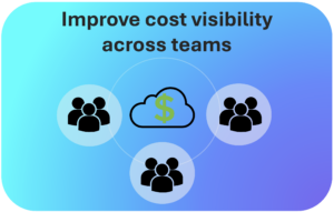
This is true not just technically, but also financially, because every cloud resource would cost you money. Always ensure that there are no dark spots in your infrastructure and that everything is perfectly transparent for you and your key stakeholders for optimal use of the infrastructure.
Why should you use a cloud architecture diagram?
There are various advantages to implementing cloud diagrams in your firm. For example diagrams help in the retention of knowledge. They also improve the understanding and a person can retain it easily in his memory.
1. Improve teamwork and communication
Key stakeholders can map the relationship between present cloud resources and determine configuration details using an architecture diagram. It is beneficial to both existing and new users. Because cloud environments are constantly changing. Hardware and software are updated on a regular basis to maximize security and improve user experience.
2. Showcase standards
Every customer wants to use the finest product at the best price. Using an architecture diagram, you can demonstrate that the product you are delivering complies with industry standards and is a certified product.
3. To plan and demonstrate future expansion
Everyone aspires to grow more, and a similar rule applies to the cloud infrastructure. An architecture diagram makes it simple to integrate and deploy new components. As a result, it is easier to double-check the changes before making the final changes. One can also just plan for these changes or adjustments to be done in the future.
4. Identifying anomalies
A cloud architecture diagram allows a user to readily identify which components should be added and which should be eliminated. It can also be used to examine resources and security breach.
Types of Architecture diagram
There are various types of diagrams, each with a distinct purpose.
1. DevOps architecture diagram
This type of diagram, as the name implies, showcases information useful for DevOps such as continuous planning, development, integration, deployment, operations, and learning. The ultimate purpose of these types of diagrams is continuous deployment and meeting the needs of users, because automating most operations boosts efficiency. These diagrams are used to constantly enhance a product or service. It is also utilized to improve the application deployment process.
2. The deployment diagram
Deployment diagrams depict how software is installed on system hardware components. These types of diagrams are particularly valuable for system engineers. With these, one can demonstrate efficiency, maintainability, portability, and scalability. It is easier to keep track of your complete system when hardware components are presented in proximity to one another. We can also ensure that each part of the hardware is being utilized and is essential. In case it is non-essential we can identify and remove it.
3. The class diagram
Class diagrams are the most frequently utilized form of UML diagrams. Because many types of software are developed using object-oriented programming, in which developers identify the various types of functions that can be used. Class diagrams depict the system’s static structure, which includes classes, their properties, and behaviors. They also show the relationships between each class.
A class is represented as a rectangle with three vertically stacked compartments—the top compartment carries the class’s name and is required, however the bottom two compartments provide information about the class’s properties and class actions or behaviors.
4. Application diagram
This type of diagram represents software or cloud infrastructure in a graphical view. It shows all the components such as front-end, back-end, micro-services, database and other software components. One can see the relationship between them and the importance of each component through this diagram. It provides a bird’s-eye view of the entire infrastructure and allows us to discover loopholes and misalignment. It is very popular due to its functionality.
How to use an architecture diagram software?
Using a cloud diagram software is a relatively straightforward process. It usually consists of the following elements:
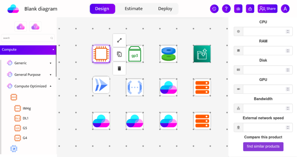
- A grid that will display the diagram and allow icons to be moved.
- A collection of icons organized by category for your convenience.
- A side panel that appears when an icon is selected, revealing additional info and providing various configurable options.
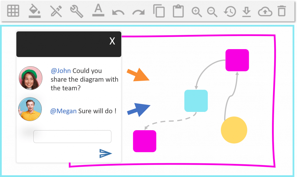
- A toolbox with various tools to link the diagram elements together such as arrows etc.
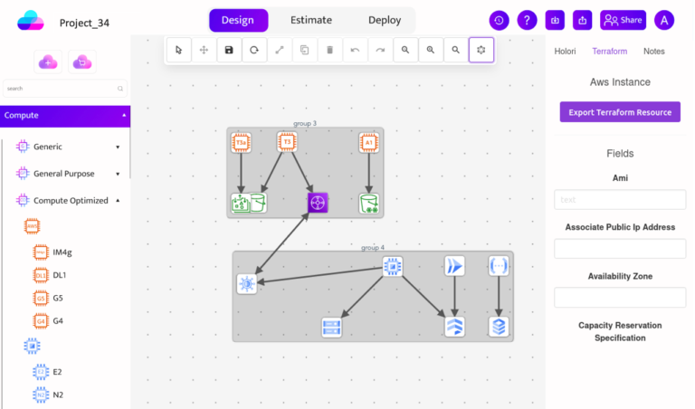
If you already have deployed an infrastructure, Holori architecture diagram software allows you to connect to your cloud providers’ accounts to import your infrastructure. After you have made changes on it, you can export the newly designed infrastructure via Terraform or Holori directly pushes it through the cloud providers’ APIs to provision the according resources.
These import/export methods have been designed to ensure maximum compliance with your company’s IT department’s security needs.
When designing your diagram from scratch, you first need to add cloud product icons on the grid. Those icons are either unique to a provider such as AWS, or Azure, or you can use generic ones. Then you may sort them by a group to see the locations, network groups, and so on. You may also use arrows to show the data flow between components. As previously stated, you can more precisely characterize your requirements for each aspect, such as technical attributes (GPU, Storage) or network requirements (min/max bandwidth). Additionally, the diagram can help you understand and forecast cloud costs.
How to reduce cloud costs with an architecture diagram?
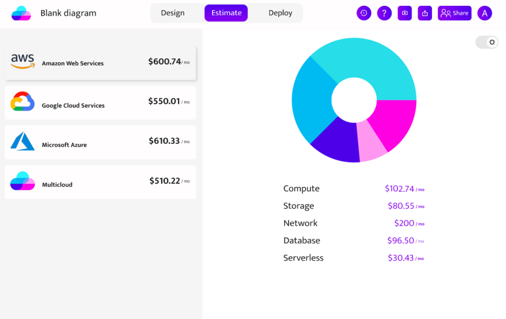
To begin, using a cloud diagram will help you visualize your complete existing infrastructure at a glance. As a result, you can discover VMs or services that you forgot existed or that are no longer functional; it is quite useful to comprehend the interplay between elements and any isolated object. Cleaning up idle cloud resources will significantly enhance your setup’s cost efficiency.
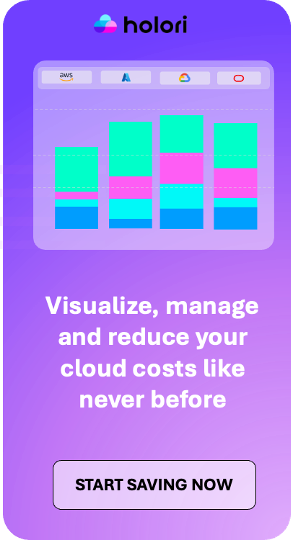
Secondly, drafting your future cloud project can result in an accurate cost estimation. Holori can even help further and save up to 70% on cloud costs by benchmarking and assessing the cloud providers’ services in every location. Indeed, the price of the same resource has significant differences at different locations and manually it is impossible to find the best deal.
When creating your diagram you can choose a specific provider’s services or generic icons if you don’t know all the flavors of a single provider’s catalog. Holori can convert your AWS diagram to a GCP diagram to optimize cost or convert your generic diagram into a combination of providers for a genuinely multi-cloud design. All of these facilities enhance the productivity of DevOps and make their work easy.
In a nutshell, Holori runs simulations with thousands of scenarios to find cloud cost and infrastructure optimization opportunities.
Why is Holori the best cloud diagram tool on the market?
There are some generic tools for drawing architecture diagrams in the market. However, in the DevOps world, they come with limitations. Drawing an architecture diagram takes hours, and then provisioning the cloud infrastructure takes even more time. If you want to complete both tasks in one shot, it’s time to switch to Holori, which is created exclusively for the cloud industry. We ensure that every Cloud Architect, Developer, and DevOps have the right tools they need to perform their jobs the best possible way.
Whether you’re a complete novice or a seasoned pro in the cloud market, Holori got you covered. You don’t need any type of certification to start with Holori. Its user interface is so easy to use that you can just log in and start drawing your cloud architecture diagram right away. You’ll be able to design diagrams for multiple cloud providers such as AWS diagram, Azure diagram, GCP diagram and much more. It connects to your provider’s console and imports your existing infrastructure to build projects using AWS, Azure, and GCP icons. You can monitor and track your entire infrastructure use at a glance.
Holori software is powered by Holori cloud calculator which is a unique tool on the market. It compares over 50,000 cloud products from various cloud providers to ensure that you get the best performing architecture running at the best possible cost.
Last but not least, Holori can export your cloud architecture diagram into a real infrastructure automatically through terraform or via API connection to the cloud provider console . Whenever you make changes in a diagram, it represents the changes in your real live infrastructure as well. Who can claim that their cloud providers’ consoles are UI friendly?
Give a try to Holori and manage your infrastructure directly from a diagram !