As Google Cloud Platform environments continue to mature, architecture visibility has become a first-class operational concern. Modern GCP infras now span dozens or hundreds of projects, shared VPCs, service networking, managed Kubernetes clusters, and a growing number of serverless and data services. Understanding how all of these components interact is no longer achievable through static documentation alone. Finding the best GCP diagram tool is clearly not easy.
In 2026, GCP diagram tools are indeed not just drawing utilities. They are used daily by cloud architects, platform teams, SREs, security engineers, and FinOps practitioners to reason about live infrastructure, validate architectural decisions, and maintain governance in fast-moving environments.
In this in-depth guide, we review the best GCP diagram tools in 2026. The selection covers the full spectrum, from fully automated cloud discovery platforms to collaborative design tools and diagram-as-code solutions. The goal is to help you choose the right tool depending on whether you need live accuracy, structured documentation, or collaborative design flexibility.
Why GCP Architecture Diagrams Matter More Than Ever in 2026
GCP architecture has evolved in a direction that prioritizes abstraction and managed services. While this simplifies operations, it also reduces visibility. Engineers no longer manage individual servers but interact with layers of services such as GKE, Cloud Run, Pub Sub, BigQuery, and managed load balancing.
Architecture diagrams now play a critical role in:
Architecture design and validation
Platform onboarding
Security reviews and compliance audits
FinOps analysis
Incident response and dependency analysis
Change management and audit readiness
The challenge is not drawing diagrams but keeping them accurate. A diagram that does not reflect the actual state of GCP projects, networks, and IAM relationships can lead to wrong assumptions, delayed incidents, or compliance gaps.
This is why GCP diagram tools in 2026 generally fall into three categories:
Manual diagramming platforms
AI assisted and diagram-as-code tools
Automated GCP discovery and live architecture platforms
Each category serves a different purpose, and mature organizations often combine several of them.
What Defines a Great GCP Diagram Tool in 2026
A modern GCP diagram tool must go far beyond icons and boxes.
First, automation is key. The ability to connect to GCP APIs and discover actual resources is what separates documentation tools from operational tools.
Second, scalability matters. A tool must remain usable across dozens of projects and regions without turning diagrams into unreadable spaghetti.
Third, maintainability is critical. Diagrams must stay relevant over time, track changes, and support audits and reviews without requiring constant manual effort.
The Best GCP Diagram Tools in 2026
1. Holori
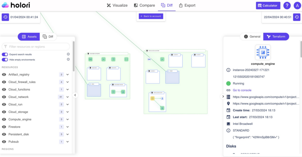
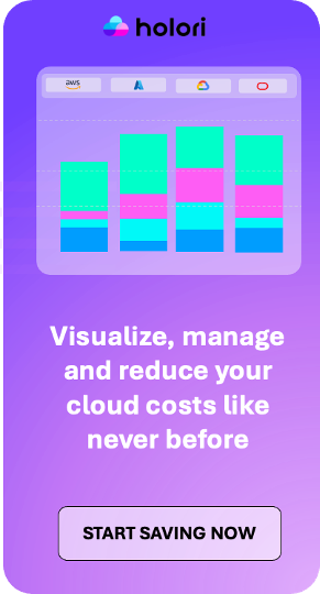
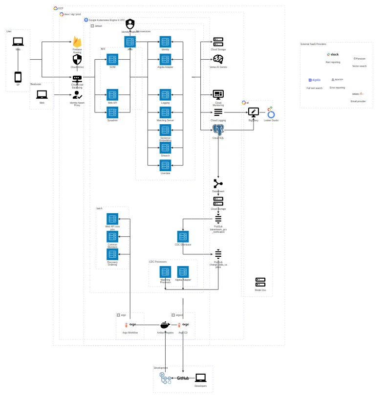
Holori is one of the most advanced platforms for automated GCP architecture visualization in 2026. Its core strength lies in connecting directly to your GCP organization and generating diagrams from real infrastructure data rather than manual input.
Once connected, Holori discovers all your resources, compute services, managed databases and numerous other components. Diagrams are generated automatically and refreshed on a daily basis, ensuring that what you see reflects what is actually deployed.
Beyond visualization, Holori exposes deep configuration details for each resource using a Terraform-like structure. This allows architects and platform teams to understand not just connectivity, but also how services are configured, which options are enabled, and where risks or inefficiencies may exist.
One of Holori’s most distinctive capabilities is its diff diagram feature. Teams can compare two points in time and visually identify what has been added, modified, or removed across projects and regions. This is particularly valuable for change management, incident analysis, and audit preparation.
Holori also integrates cost data. By associating GCP spend with resources and services, it enables FinOps teams to reason about cost drivers in architectural terms rather than spreadsheets. Its support for multi-cloud environments makes it suitable for organizations operating across GCP, AWS, and Azure.
2. Draw.io
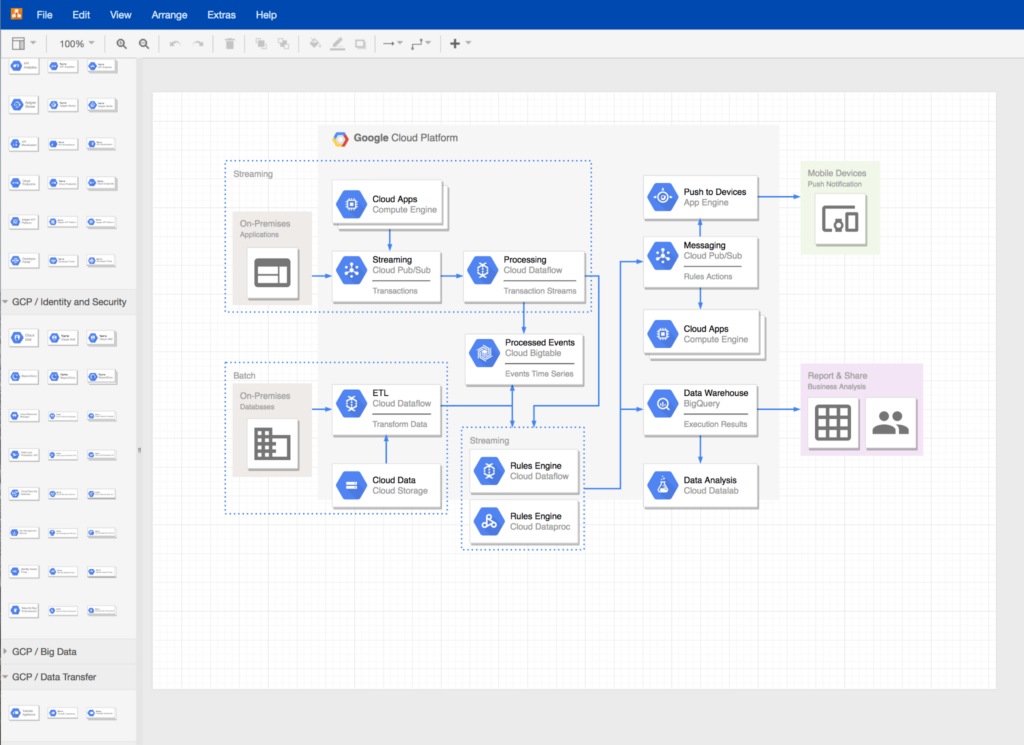
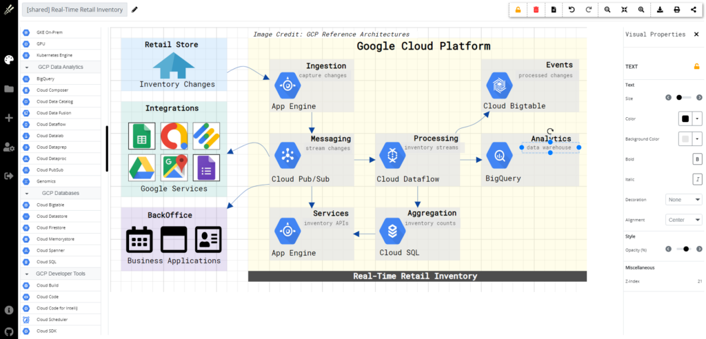
Draw.io remains one of the most widely used manual diagramming tools for GCP architectures. It provides a comprehensive library of official Google Cloud icons and allows teams to create clear and professional diagrams with full control over layout.
Its popularity comes from its accessibility. Draw.io is free, browser-based, and integrates seamlessly with Google Drive, GitHub, and Confluence. It is often used for documentation, training material, and architectural overviews where automation is not required.
However, Draw.io is entirely manual. It does not connect to GCP APIs and does not update diagrams automatically. As a result, it is best suited for static documentation or conceptual designs rather than live infrastructure representation.
Despite these limitations, Draw.io remains a foundational tool in many organizations, especially early in cloud maturity.
3. Lucidscale
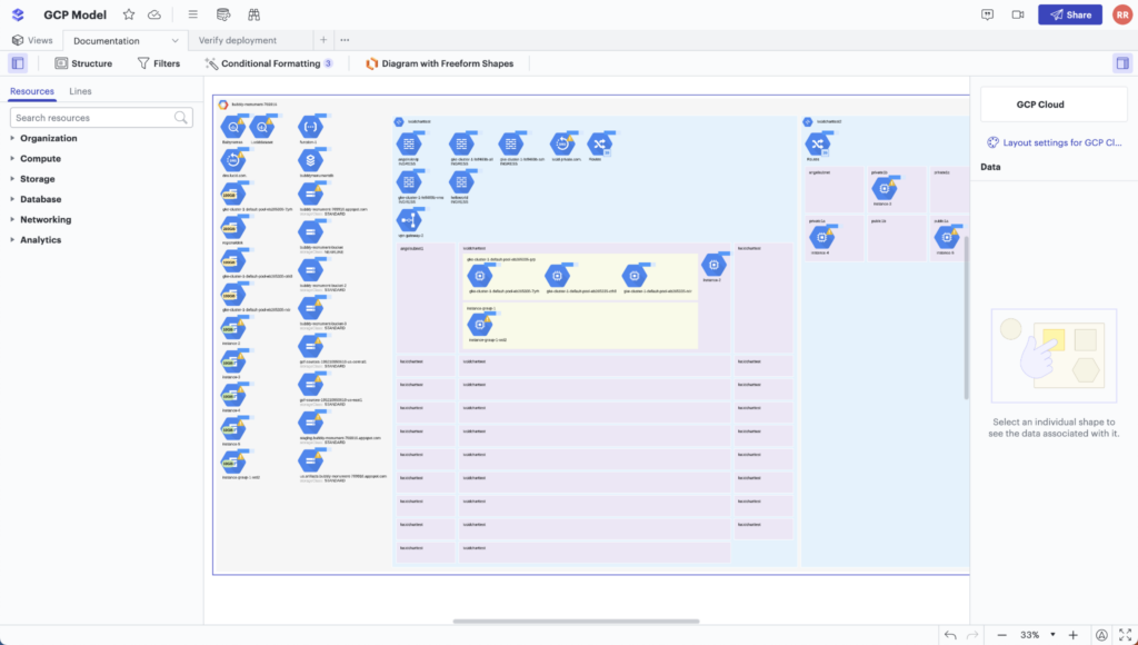
Lucidscale is an automated cloud visualization tool designed for large-scale GCP environments. It connects to GCP APIs to import live infrastructure data and generates architecture diagrams that reflect real deployments.
Its main value lies in its ability to handle complexity. Lucidscale can visualize large numbers of projects and services while allowing users to filter views by labels, regions, or service types. This makes it suitable for platform teams managing broad GCP estates.
Lucidscale integrates tightly with Lucidchart, enabling teams to refine automated diagrams manually and embed them into documentation systems such as Confluence or Jira. This combination works well for organizations that need both automation and polished presentation.
While Lucidscale focuses primarily on structure and dependency visualization, rather than cost or configuration depth, it is a solid choice for enterprises that need scalable and shareable GCP architecture views.
4. CloudSkew
CloudSkew is a browser-based cloud diagramming tool with strong support for GCP icons and architecture patterns. It is designed specifically for cloud diagrams rather than generic flowcharts, which makes it faster to produce structured GCP layouts.
CloudSkew focuses on clarity and collaboration. Diagrams are automatically saved, easily shared, and can be edited by multiple users. While it does not offer automated discovery, it excels in iterative design workflows where architecture is evolving and discussion is ongoing.
For teams that want a cloud-native alternative to traditional diagramming tools without the complexity of full automation platforms, CloudSkew offers a balanced middle ground.
5. Miro
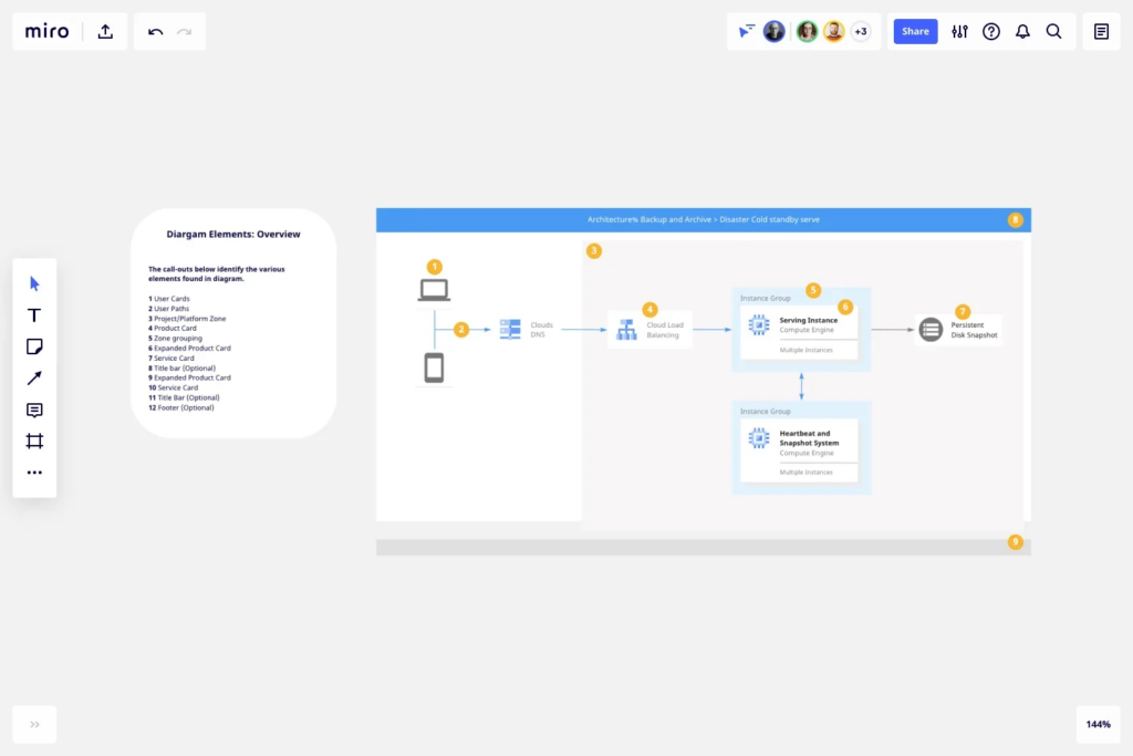
Miro is a collaborative whiteboard platform widely used for architecture workshops, migration planning, and cross-team design sessions. It provides GCP icon libraries and templates that enable teams to sketch cloud architectures interactively.
Miro’s strength is collaboration rather than precision. Multiple stakeholders can work on the same canvas in real time, making it ideal for design reviews, brainstorming sessions, and alignment workshops involving both technical and non-technical participants.
While Miro does not connect to GCP or provide automated accuracy, it plays an important role earlier in the lifecycle, when ideas are still forming and communication is more important than exact representation.
6. Visual Paradigm
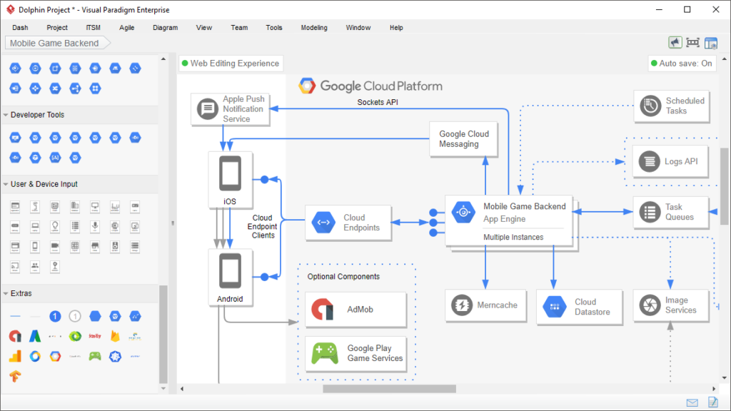
Visual Paradigm offers a professional-grade GCP diagramming tool aimed at structured architecture documentation. It supports official GCP icons, layered diagrams, and a wide range of export formats.
The platform is particularly suited to formal documentation and architecture governance. Diagrams can be standardized across teams, reused in reports, and maintained alongside other system documentation.
Visual Paradigm does not provide live GCP discovery, but its strength lies in producing consistent, presentation-ready diagrams that meet enterprise documentation standards.
7. Creately
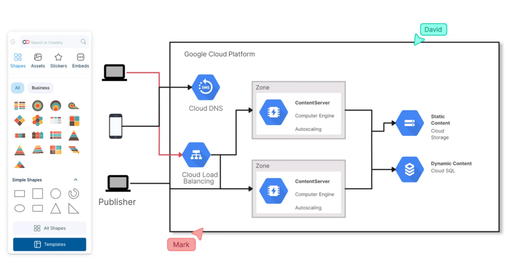
Creately is a visual collaboration and diagramming platform that supports GCP architecture diagrams through dedicated icon libraries and templates. It combines diagramming with workspace organization, making it useful for teams managing multiple architectures or environments.
Creately supports real-time collaboration and version history, allowing teams to track changes over time even in manual diagrams. It is particularly useful for distributed teams that need to co-author architecture documentation.
While not an automation tool, Creately is well suited for structured manual design and collaborative documentation efforts.
8. Excalidraw
Excalidraw offers a lightweight, sketch-style approach to GCP diagramming. Its hand-drawn aesthetic encourages rapid iteration and informal discussion rather than perfection.
It supports GCP icons and is often used during early design conversations, incident debriefs, or architecture explanations where speed and clarity matter more than detail.
Excalidraw is not intended for production documentation, but it excels at capturing ideas quickly and enabling frictionless collaboration.
9. Hava
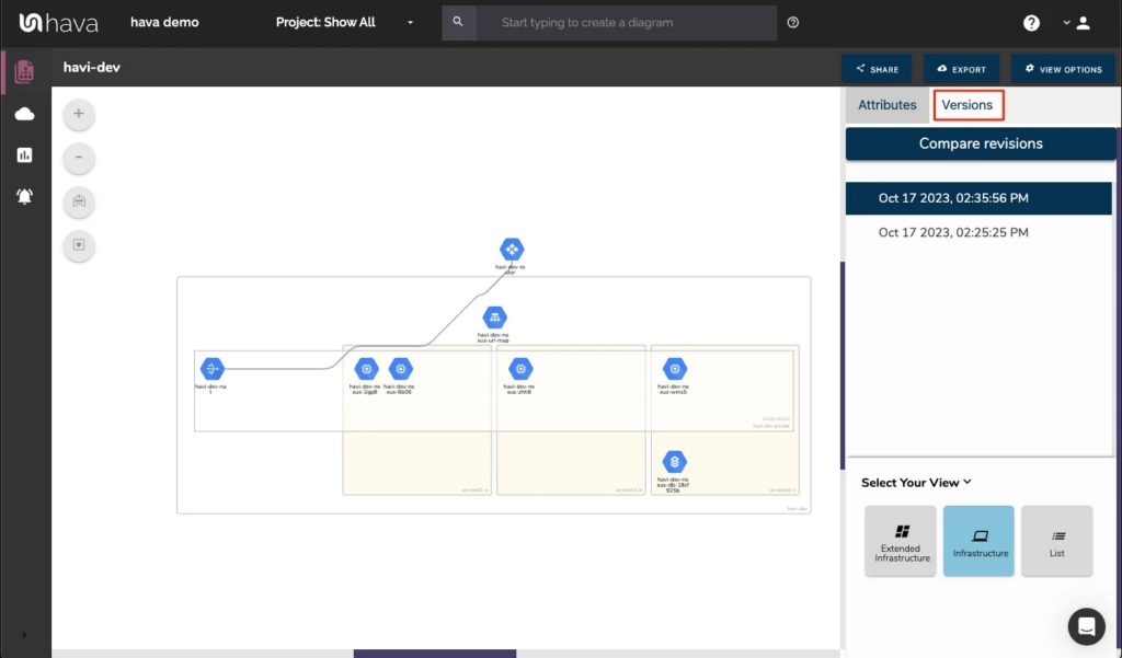
Hava focuses on continuous cloud mapping and audit-ready documentation for GCP environments. After connecting to a GCP service account, it automatically scans infrastructure and produces interactive diagrams that represent the current state of the environment.
Hava’s diagrams emphasize logical clarity. Resources are grouped by VPC, subnet, and region, making it easier to understand traffic flows and architectural boundaries. Unlike static exports, these diagrams update automatically as infrastructure changes.
A key strength of Hava is historical tracking. The platform stores snapshots of your environment over time, allowing teams to review how architecture evolved and identify when specific changes occurred. This capability is especially useful for compliance reviews, post-incident investigations, and internal audits.
Hava also supports multiple export formats, enabling diagrams and underlying data to be reused in other tools or documentation workflows. For organizations where accuracy, traceability, and auditability are top priorities, Hava is a strong choice.
10. Mermaid
Mermaid represents the diagram-as-code approach to GCP architecture visualization. Using a simple text syntax, engineers can generate diagrams directly within Markdown documentation.
Although Mermaid does not provide native GCP discovery or official icon sets, it integrates seamlessly into Git-based workflows, CI pipelines, and documentation systems such as GitHub and GitLab.
Mermaid is particularly attractive to engineering teams that want architecture diagrams to live alongside code and evolve through pull requests rather than manual edits.
Conclusion: What Is the Best GCP Diagram Tool in 2026
In 2026, the real challenge is not creating GCP diagrams but keeping them aligned with reality. As cloud environments change daily, static diagrams lose their value almost immediately.
For organizations that need continuous accuracy, change tracking, and cost visibility, automated discovery platforms such as Holori stands out as the most complete solution. It treats diagrams as living assets rather than static files.
Manual and collaborative tools like Draw.io, CloudSkew, and Miro remain essential during design and communication phases, while diagram-as-code tools like Mermaid support modern engineering workflows.
The best approach is often a combination of tools, but if accuracy, automation, and operational insight are your priorities, Holori provides one of the strongest foundations for GCP architecture visibility in 2026. This is especially true if you are willing to push your infra understanding a bit further with FinOps data.
Ready to give it a try? Go to https://app.holori.com